E-commerce Website Redesign- Protoyping
@Butopea - Hungary
This is a UX Design Sprint project I led at my university for a company called Butopea - An E-Commerce website to purchase and browse household products (a home interior service that inspires customers to be creative with their interior design)
The main focus was to redesign the search operation, Homepage, Product page, and Purchase order page.
Navigation of the website was: Mostly Downward and Hierarchical.
Overview
The high-level requirement of the project was to enhance the website's design by introducing a few creative elements while maintaining the traditional look and feel. It took about two weeks to complete the design sprint and produce an actionable outcome - Prototype.

Fig 1.1 Original Version of the Website

Search bar voice to text input added
Language Options added
Fig 1.2 Intermediate Redesigned version of the Website
Problem Statement
The two main pain points Butopea presented me with were,
-
The conversion rate for the website was low.
-
Users kept constantly asking customer support about the estimated delivery time of their product.
Users and Audience
-
Users of the Website were people who would like to purchase household goods and order them for door delivery
-
Upon stakeholder interviews, it was discovered that the majority of the purchases were made by youngsters and middle-aged Hungarians
-
whereas occasionally there were international customers too.
Roles and Responsibilities
As a UX Designer, I did a comparative analysis of the websites -IKEA, Amazon, Flipkart, etc falling into Tier 2, which delivered similar services and were indirect and direct competitors.
Scope and Constraints
The timeline available was 2 (Two) Weeks, and within the limited period and budget, available secondary research was preferred to extensive evaluative research via usability studies.
Process
These questions were addressed using comparative analysis as a quick workaround for the User research given the time constraints.
After the Virtual Ethnography of the website, I saw that Comparative analysis is fit to start with to understand where there is a lack of promise to customers and where was Butopea falling shortly compared to other e-commerce giants.
As mentioned in Fig 1.3 Design thinking through five stages was the approach taken. Thanks to Figma for rapid prototyping.

Fig 1.3 Design thinking adaptation for Butopea project with a few highlighted methods and strategy
Key Design Impact
-
The placement of the search bar has been realigned in the center at the top for better discoverability and visibility. It is changed to be Persistent instead of expandable.
-
Around 30 percent of e-commerce website visitors prefer searching for the product directly rather than browsing.
-
Originally the search option was hidden to the right corner.
-
A Globe icon that can enable users to change the language has been implemented. This can be given in two alternatives. One: a globe icon (affordance with a signifier) indicating in which language the page is currently.
-
Once it is triggered the page changes to the other alternative language.
Persistent Search Bar included

Fig 1.4 Redesigning Search bar after comparitive analysis
-
A CTA button that is highlighted in a different color ensures attention.
-
Product page realigning:
-
Originally, a long product page is preferable.
-
The different dimensions of the product are provided as a scrolling set of galleries in the main area with all the essential information tagged to the right bottom corner.
-
There are functionalities to knowing the ETA for the goods but it is static, there is no way to compute it depending on the distance you are from the warehouse.
-
Clear CTA with an attention-seeking color is added for Adding to the cart.
-
Color changing function to change the color (property) of the product is provided.
-
Another functionality is to purchase directly the product skipping the ATC action.
-
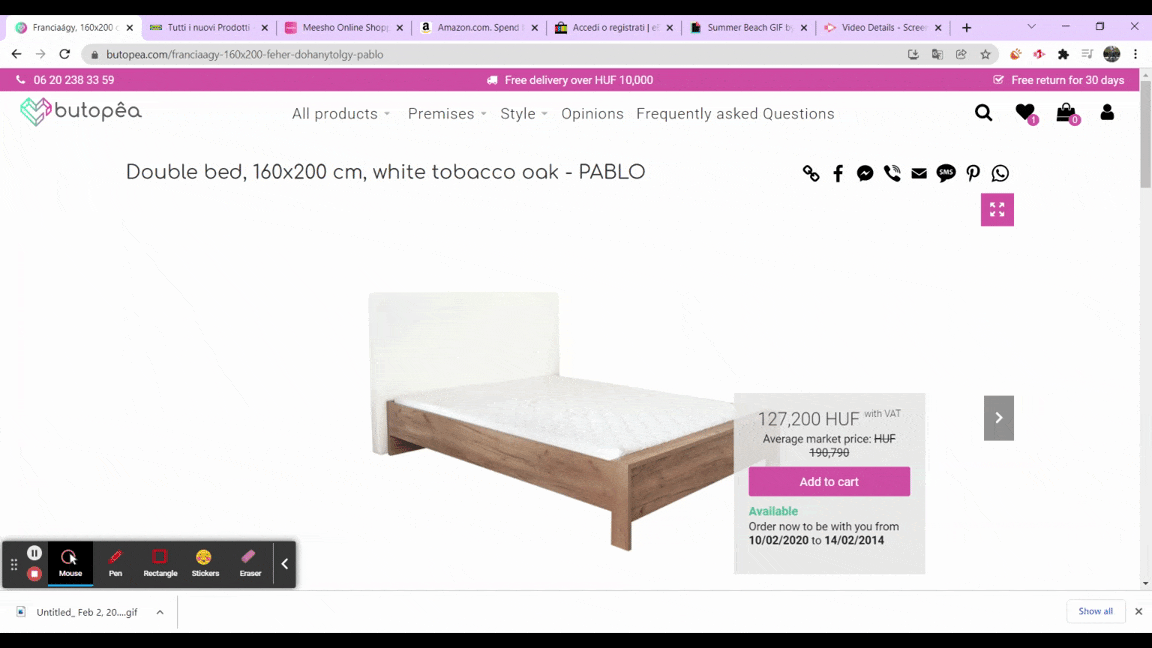
Fig 1.5 Old Product Page before redesigning

Fig 1.6 Redesigned Product Page
My Learnings
-
It is important to do usability testing for websites before moving on to the next iteration because even though competitive analysis provides an outline of how to advance other research methods do enable designers an edge over comparative analysis.
-
Colour contrast and language availability are two major factors for Inclusive Design
For additional findings and learnings, please contact - preerampr@gmail.com.